
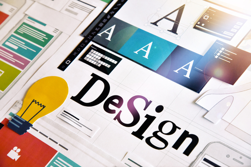

You approved the design. It looked right. The printed piece arrives and the colors are duller, the edges are cut wrong, or the whole thing looks slightly off in a way that's hard to name.
This is one of the most common and most preventable problems in small business marketing, and it comes down to a handful of technical differences between screens and paper.
A screen makes color by emitting light — red, green, and blue combined to produce every color you see. That's RGB. Add all three at full strength and you get white.
Paper does the opposite. Ink absorbs light, and what bounces back is the color you see. Printing uses cyan, magenta, yellow, and black — CMYK. Combine them all and you get something close to muddy black.
These aren't the same set of possible colors. Screens can display vivid blues, bright greens, and intense oranges that ink physically cannot reproduce. When a design built in RGB gets converted for print, those colors shift to the nearest achievable equivalent — which often looks noticeably flatter.
Screens create color by emitting light (RGB) and printing creates color by absorbing it (CMYK). Some colors visible on screen cannot be reproduced with ink, so designs built in RGB shift when converted for print. Building in CMYK from the start prevents the surprise.
The fix isn't complicated: design in CMYK when the destination is print. What you see on screen still isn't exact, but it's a far closer approximation than an RGB file converted at the last moment.
Screens display around 72 pixels per inch. Print needs roughly 300 dots per inch to look sharp.
That means an image that looks perfect on your website is roughly a quarter of the resolution a printer needs. Enlarging it doesn't add detail — it just makes the existing pixels bigger, which is why web images look soft or blocky in print.
Practical rule: if the only copy of an image you have came off a website, it probably isn't usable for print at any meaningful size. Ask for the original.
Commercial printing happens on sheets larger than the final piece, which then get trimmed. Trimming is mechanical and has a small margin of error.
If your background color or image stops exactly at the edge of the design, any tiny variation in the cut leaves a thin white line along one side. The fix is bleed — extending artwork past the trim line, typically by an eighth of an inch, so there's material to cut into.
The corresponding rule is the safe zone: keep text and important elements at least an eighth of an inch inside the trim line so nothing critical gets clipped.
Bleed means extending background artwork past the trim edge, usually by 0.125 inches, so slight variation in cutting doesn't leave white slivers. Keep text and essential elements at least 0.125 inches inside the trim line to avoid clipping.
If you send a file that references a font the printer doesn't have installed, their software substitutes something else — and your layout reflows without anyone noticing until it's printed.
Two standard solutions: embed the fonts in a print-ready PDF, or outline the text, converting letters into shapes. Outlining is bulletproof but makes text uneditable, so keep an editable copy.
A subtle one that catches people. In CMYK, plain black (100% K) prints as a slightly washed grey-black across large areas. For large solid blocks, printers use rich black — black mixed with some cyan, magenta, and yellow — to get real depth.
Small text should stay single-color black. Fine type printed in rich black can show colored fringing if the plates are slightly misaligned.
Most printers will provide a proof — either a PDF showing exactly what will print, or a physical sample. For anything with a meaningful quantity or cost, take the physical proof.
Reviewing a proof on a screen defeats the entire purpose of everything above.
Why do my printed colors look different from my screen?
Screens use RGB, which creates color with emitted light. Printing uses CMYK, which creates color with ink absorbing light. Some screen colors can't be reproduced with ink and shift to the nearest available match. Design in CMYK when the output is print.
What resolution do images need for printing?
Around 300 DPI at the final printed size. Web images are typically 72 DPI, which is roughly a quarter of what print requires, and enlarging them doesn't add detail.
What is bleed in printing?
Artwork extended past the trim edge, usually by 0.125 inches, so that small variations in cutting don't leave white slivers along the edge of the finished piece.
What is a safe zone in print design?
The margin inside the trim line — typically 0.125 inches — where text and essential elements should stay so nothing important gets cut off during trimming.
Why does my printer need fonts embedded or outlined?
Because if they don't have your font installed, their software substitutes a different one and your layout reflows. Embedding fonts in the PDF or converting text to outlines prevents this.
What file format should I send to a printer?
Usually a print-ready PDF with fonts embedded, images at 300 DPI, CMYK color, and bleed included. Confirm specifics with your printer, since requirements vary slightly.
Need print files that come back looking right the first time? Schedule a free consultation at jpetrous.com | contact@jpetrous.com | 586-563-6634.






.jpg)

.jpg)
The businesses winning in Michigan aren't chasing trends. Jonathan Petrous shares a practical 2027 marketing playbook built specifically for the Michigan small business market.
Read More
Great local businesses in Marysville, Chesterfield, and Macomb Township are invisible online — and it's fixable. Jonathan Petrous explains the three most common causes and exactly what to do about them.
Read More
Tight marketing budget in Port Huron or the surrounding area? Jonathan Petrous shares the highest-leverage moves local businesses can make right now — most of them free or nearly free.
Read More


Jpetrous Creative Services proudly supports businesses across:
Macomb County • St. Clair County • Metro Detroit • Southeast Michigan
Including communities like:
New Baltimore • Chesterfield • Sterling Heights • Clinton Township
St. Clair • Marysville • Port Huron • Rochester • Auburn Hills • Detroit
































Before you go
Call or send a message. Tell me what you're working on and I'll tell you honestly whether I'm the right fit.